Phone App All Contacts UI

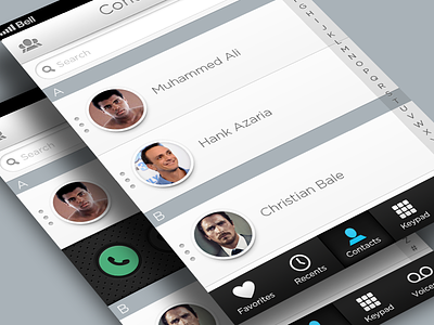
I'm learning After Effects and wanted to animate something cool so I began redesigning Apple's phone UI. I will be creating most screens that can be found within it, keeping the UX essentially the same but also adding features that may improve the experience.
VIEW THE ATTACHMENT for real pixels.
Most icons were created by Matt Gentile.
I'll probably upload each screen as I complete them and eventually animate the entire application. Feedback is welcome!


