Redesign of The Green House

Green-house

1 Attachment

12 Responses

  1. Pro Sunil Joshi Sunil Joshi

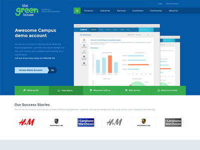
    Guys, started with the re-design of www.thegreenhouse.co.uk website. Please check the full preview and let me know your thoughts.

    3 months ago

  2. Kenil Bhavsar Kenil Bhavsar

    Wow look great. Perfect Metro UI.

    3 months ago

  3. Pro Sunil Joshi Sunil Joshi

    @Kenil Bhavsar thanks !

    3 months ago

  4. Kenil Bhavsar Kenil Bhavsar

    @Sunil Joshi My Pleasure.

    3 months ago

  5. Pro Kurt Gröner  Kurt Gröner 

    @Sunil Joshi Nice look!

    3 months ago

  6. Pro Luboš Volkov Luboš Volkov

    Looks really nice, but i have suggestions - hole design is flat design so why is the preview on of the pages (main section) displayed in the regular browser window. Make it flat to - grey header (3 colorful crcles) - flat. And its going to rock! :)

    likes

    3 months ago

  7. Pro Sunil Joshi Sunil Joshi

    3 months ago

  8. Pro Sunil Joshi Sunil Joshi

    @Luboš Volkov thanks ! will do it...

    3 months ago

  9. James Deer James Deer

    Nice— though there are hardly any call to actions in regards to setting up an account / scheduling a demo.

    3 months ago

  10. Pro Sunil Joshi Sunil Joshi

    @James Deer thanks ! yes you are right, i am going to do some changes to the design and also going to focus on call to action part.

    3 months ago

  11. Pro krishnachaitanya krishnachaitanya

    really looks nice :) clean and simple :)

    3 months ago

  12. Pro Sunil Joshi Sunil Joshi

    3 months ago

keyboard shortcuts: previous shot next shot L or F like