18 Responses

  1. Pro Ryan Ford Ryan Ford

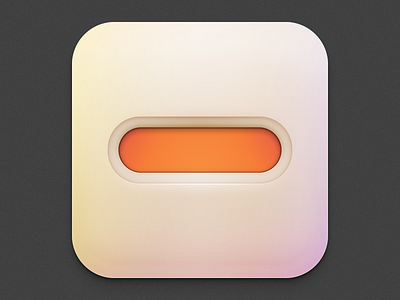
    An iOS icon I made for the guys at minus (minus.com) for a new app. I kept the lid on this one for a while but just found out yesterday that they suddenly shifted the app direction, so this icon went unused. Still, the gradient came out nice, and I'm pretty happy with the results. I must've made 20 variations of this simple concept, too. Aimed for a soft, "touchable" icon look.

    likes

    3 months ago

  2. Pro Adam Bubeníček Adam Bubeníček

    The gradient is crazy, good job

    likes

    3 months ago

  3. Pro Ryan Ford Ryan Ford

    3 months ago

  4. Pro Isaac Grant™ Isaac Grant™

    Epic domain name.

    Btw cool icon.

    likes

    3 months ago

  5. Pro Ryan Ford Ryan Ford

    Thank you, @Isaac Grant™ . Their site is pretty cool. I was stoked that they asked me to work on an icon for them.

    likes

    3 months ago

  6. Pro Garrett Gee Garrett Gee

    I don't want minus.com on my phone but I want this icon on my phone so I will download minus.com onto my phone if it means getting this beautiful icon onto my phone..

    likes

    3 months ago

  7. Pro Ryan Ford Ryan Ford

    @Garrett Gee Hate to do this to you, but they're not using this one. They have a different, not-made-by-me, icon.

    3 months ago

  8. Pro Garrett Gee Garrett Gee

    Wha?! This icon was too good to be true from the beginning I guess..

    3 months ago

  9. Pro Ryan Ford Ryan Ford

    @Garrett Gee I was surprised as well, but hey it was their call. Still, I spent so much time working on this velvety gradient that I'm sad they didn't use it.

    3 months ago

  10. Newar Newar

    Beautiful! Damn shame they went with something else.

    Am I crazy or are they still using this icon as their favicon on minus.com?!

    likes

    3 months ago

  11. Pro Cole Townsend Cole Townsend

    Visited the site, not sure they deserve something so awesome.

    3 months ago

  12. Pro Callum Chapman Callum Chapman

    It looks great, they're fools for not using it!

    3 months ago

  13. Pro Travis Silverman Travis Silverman

    Killer gradient @Ryan Ford. Inspiring in that as soon as I saw this, I thought, I must learn the ways of such spectacular gradient creation.

    3 months ago

  14. Pro Ryan Ford Ryan Ford

    Patience, young padowan. @Travis Silverman

    3 months ago

  15. Pro Andy Eveland Andy Eveland

    @Ryan Ford amazing... although the bacon icon will always rival anything you do. Great work.

    Touch-able= CHECK!

    3 months ago

  16. Pro Martin David Martin David

    what they are not using the gradient! ok, their problem! thanks for showing that minimal beauty.

    3 months ago

  17. Pro Kovalev Slava Kovalev Slava

    Awesome icon!

    3 months ago

  18. Pro Luboš Volkov Luboš Volkov

    This is nice @Ryan Ford

    2 months ago

keyboard shortcuts: previous shot next shot L or F like