Find designers
Designer search
Quickly find your next designer
Post a job
The #1 job board for design talent
Inspiration
Courses
UX Diploma
Learn UX design from scratch in 6 months
UI Certificate
12-week UI skill building for designers
Live interactive workshops
with design professionals
Jobs
Go Pro
Log in
Dribbble: the community for graphic design
Log in
Sign up
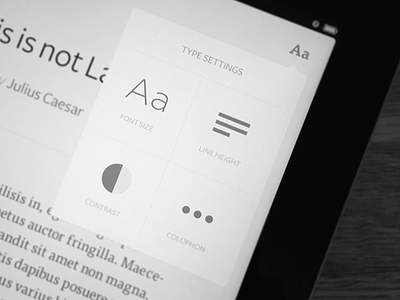
Lighter Type Settings
Ari Sawyers
Follow
Following
Like
#DFDFDF
#121212
#A5A5A5
#666666
Download color palette
A lighter version.
awesomeness
flat design
fonts
freight sans
gotham
ipad app
light
minimal
minimalism
simple
tisa pro
typography
yay
View all tags
Posted on Feb 11, 2013
9,750
60
330
9
View feedback
Ari Sawyers
More by Ari Sawyers
View profile
Previous
Next
Loading…