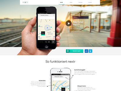
nextr app landing page

28 Responses (page 1 of 2)

  1. Martin Oberhäuser Martin Oberhäuser

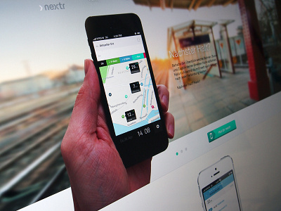
    I replaced the hand, and gave the main navigation a little more emphasis.

    likes

    3 months ago

  2. Pro Tanveer Junayed  Tanveer Junayed 

    Nice clean work Martin. I'd like to see some depth under this iPhone here http://d.pr/i/br6G

    likes

    3 months ago

  3. Pro « Christoph Wolfe » « Christoph Wolfe »

    It came out really great. But seriously this hand needs to be fixed haha.
    Good luck with the launch.

    3 months ago

  4. Benjamin Fritz Benjamin Fritz

    Why is the "Get app" button raised while the social interaction icons are flat?

    likes

    3 months ago

  5. Martin Oberhäuser Martin Oberhäuser

    @Benjamin Fritz because I want to emphasize the "Get app" button. But you might be right, maybe it's not needed...

    likes

    3 months ago

  6. Pro Nuruzzaman Sheikh Nuruzzaman Sheikh

    Love the cleans!

    3 months ago

  7. Benjamin Fritz Benjamin Fritz

    @Martin Oberhäuser I find it's rather breaking the consistency. Emphasis comes through the color and size, I would say.

    likes

    3 months ago

  8. Mathieu Vallee Mathieu Vallee

    @Martin Oberhäuser @Benjamin Fritz +1, the buttons should be with the same style!

    likes

    3 months ago

  9. Pro Adam Pickering Adam Pickering

    That guys hands are not that great looking ;) you need a better hand model :)

    likes

    3 months ago

  10. Pro Avinash Tripathi Avinash Tripathi

    ohh u beauty! Gr8 J

    likes

    3 months ago

  11. Pro Andrew Korytsev Andrew Korytsev

    It looks just awesome!

    3 months ago

  12. Pro Ilie Ciorba Ilie Ciorba

    I really like your style @Martin Oberhäuser, unfortunately I will have to steal some ideas from you :)

    likes

    3 months ago

  13. Pro Zach Roszczewski Zach Roszczewski

    Slick & Sexy, Nicely done mate.

    3 months ago

  14. Diego Beas Diego Beas

    amazing like always

    3 months ago

  15. Pro Andy Eveland Andy Eveland

    Openness feels amazing. Love it!

    3 months ago

  16. Pro Cat Lo Cat Lo

    the "x" in the logo looks like a copy of yext.com

    3 months ago

  17. Pro Vitor Lourenço Vitor Lourenço

    Great work. Is that Lineto’s Akkurat? If so, would love to learn a bit more about how you’ve acquired a web/mobile license for it.

    3 months ago

  18. Pro Dreamix Studio Dreamix Studio

    Looking good Martin!

    3 months ago

  19. Pro Dirk Jan Haarsma Dirk Jan Haarsma

    Nice design man. Also a great city, Hamburg :)

    3 months ago

  20. Alok Alok

    the hand steals the concentration from the app. Maybe a female hand will look more appropriate.

    3 months ago

  21. Martin Oberhäuser Martin Oberhäuser

    @cat I've never seen the "yext" logo before, but there are many logos out there with "...ext..." in the name, so it's hard to avoid similarities.

    @Vitor Lourenço you're right about the font. I was hoping that Lineto comes out with a web version before we launch, but apparently they won't so I'll have to change it to a DIN or something similar... ;)

    3 months ago

  22. Pro Jose E. Gonzalez Modecir Jose E. Gonzalez Modecir

    I need this app so bad! Want to get rid of the Deutsche Bahn app for years now.

    Looking great!

    3 months ago

  23. Pro George Angeloff George Angeloff

    Very nice and clen design!

    3 months ago

  24. Pro Petar Clean Simic Petar Clean Simic

    Didn't see something smooth like that landing page for a while now. Me gusta Nextr icon especially :)

    3 months ago

  25. Pro Sean Thompson Sean Thompson

    Really nice type!

    3 months ago

keyboard shortcuts: previous shot next shot L or F like