Find designers
Designer search
Quickly find your next designer
Post a job
The #1 job board for design talent
Inspiration
Courses
UX Diploma
Learn UX design from scratch in 6 months
UI Certificate
12-week UI skill building for designers
Live interactive workshops
with design professionals
Jobs
Go Pro
Log in
Dribbble: the community for graphic design
Log in
Sign up
Menu
Rovane Durso
Available for work
Follow
Following
Like
Get in touch
#2F343A
#F0ECE6
#B2B1B1
#797D83
#988A76
Download color palette
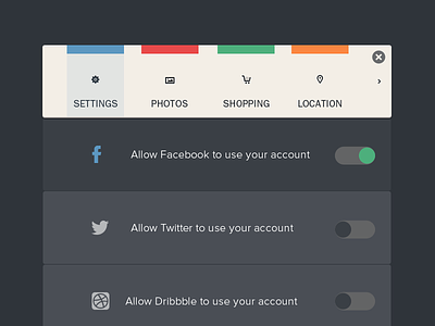
connection
design
interaction
interface
menu
social
ui
web
View all tags
Posted on Feb 8, 2013
16,301
74
418
19
View feedback
Rovane Durso
Crafting beautiful and functional websites and mobile apps
Get in touch
More by Rovane Durso
View profile
Previous
Next
Loading…
Loading…
Loading…