Browse Stories

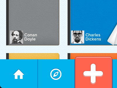

Adding a softer feel to the UI. Changed the page turning style and rounded off the main call to action. Also added a few subtle textures to the books and backgrounds.
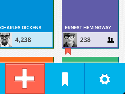
Adding a softer feel to the UI. Changed the page turning style and rounded off the main call to action. Also added a few subtle textures to the books and backgrounds.


