Introducing Your Instagram Feed on the Web

25 Responses

  1. Pro Maykel Loomans Maykel Loomans

    Today, we're proud to announce your Instagram feed on the web. I'm super excited about this, and hope you guys are too. Check it out on instagram.com.

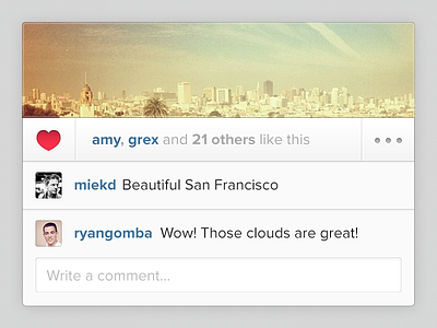
    "[...] you can now browse your Instagram feed on the web – just like you do on your mobile device. Go to instagram.com and log in to your account to give it a try."

    More info at: http://blog.instagram.com/post/42363074191/instagramfeed

    likes

    3 months ago

  2. Ari Ari

    YES

    3 months ago

  3. Pro Johan Rothoff Johan Rothoff

    Really impressive work as always!

    3 months ago

  4. Able Parris Able Parris

    Nice work, Maykel.

    3 months ago

  5. Pro Dan Rubin Dan Rubin

    Fan. Freaking. Tastic.

    3 months ago

  6. Raul Rincon Raul Rincon

    I like it, but at the same time I don't.

    I've always loved the simplicity of Instagram, it's clean design and it's approach to easy use and implementation has always struck me as the result of great minds thinking alike and always trying the best solution for each individual problem.

    This time, I think it isn't the case. The feed seems too over-crowded with stuff. I'd rather have the number of likes and the thumbails of each person, instead of the username, and even then, I'd get rid of it all together. I'd just leave the number of likes. If I wanted to know who liked which photo, I'd find out, I'd click anywhere needed to be clicked without too much trouble.

    The "minutes ago" text should be a little bit smaller. Most of the time it's bigger in length than the username itself, thus making it more noticeable, this should not be the case.

    Just two points I wanted to comment on, I'm, and will always be a fan. Cheers and grats on the new release.

    likes

    3 months ago

  7. Pro Avinash Tripathi Avinash Tripathi

    impressive!

    3 months ago

  8. Pro Daryl Ginn Daryl Ginn

    I think this design could be executed a little better.

    You should have done a dark transparent border outside of the light inner border, it'll give it more definition and rid you of that blurry edge. Because you didn't do the darker border, it now, visually, appears as if the white base is 1px smaller on either side.

    Also, in a few places you've used a 1px stroke instead of 2px.

    likes

    3 months ago

  9. Pro Ilja Miskov Ilja Miskov

    Finally!

    3 months ago

  10. Pro Rogie Rogie

    @Daryl Ginn great feedback man.

    likes

    3 months ago

  11. Pro Donald Johns Donald Johns

    Great work @Maykel Loomans

    3 months ago

  12. Pro Damian Hernandez Damian Hernandez

    Great work Maykel!

    3 months ago

  13. Pro Jordan Singer Jordan Singer

    Congrats!

    3 months ago

  14. Pro Rogie Rogie

    @Maykel Loomans very nice work, dude.

    3 months ago

  15. Pro Yummygum Yummygum

    Nice work @Maykel Loomans. Did you take that picture when you were there with @Yassine Bentaieb by any chance ;)?

    3 months ago

  16. Pro Brian Lovin Brian Lovin

    Looks and works amazingly well, congrats!

    3 months ago

  17. Pro Daniel Haim Daniel Haim

    Awesome work!

    3 months ago

  18. Pro Robert van Klinken Robert van Klinken

    Congrats! Looks great!

    3 months ago

  19. Pro Eric Hoffman Eric Hoffman

    I agree with @Daryl Ginn, but other than that, I really dig this. Good work, man!

    likes

    3 months ago

  20. Pro Maykel Loomans Maykel Loomans

    @Daryl Ginn @Eric Hoffman In regards to the highlight; if you guys find a good solution that works with both the lightest and the darkest of images, I would love to see a code drop. The implementation now is the closest we have gotten to it working in these cases, even though it is not optimal.

    The 1px remark is moot, as this is part of the dribbble mock and not the actual implementation.

    likes

    3 months ago

  21. Pro Adis Adis

    Darker border for write a comment field.

    Looks nice overall!

    3 months ago

  22. Pro Daryl Ginn Daryl Ginn

    @Maykel Loomans A darker border won't make much difference to the darker images, so you're always working with the lighter. The darker your background, the darker the border will have to be. With this one, around 30% opacity did the trick:

    http://c.daryl.im/MgK6

    Overall, I think you've done a good job dude, I forgot to mention that in my first comment.

    3 months ago

  23. Pro Julia Khusainova Julia Khusainova

    Dig it. I've been for it for sooo long! Great work @Maykel!

    3 months ago

  24. Pro Yiğit Pınarbaşı Yiğit Pınarbaşı

    Great!

    3 months ago

  25. Pro Tycho Klein Severt ⚜ Tycho Klein Severt ⚜

    Really nice styling!

    3 months ago

keyboard shortcuts: previous shot next shot L or F like