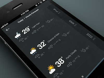
@Mike Arndt Thanks for the feedback. At the moment we're keeping it this size as the hit area will be larger than what you see. The menu will also be gesture driven (swipe up from the bottom). This [of course] is subject to change once we get a feel for it in Dev.
Slick stuff, love the numbers on the side. This might be just me, but the water droplets were a tad confusing at first glance, that for some reason makes me think of rain. Have you tried using one droplet for humidity?
Dope as usual. Maybe the text beside the small icons (umbrella, wind, rain) could be slightly darker so that easier could be more easily scanned? Or at least some more contrast in that area. It looks fresh but a tiny bit hard to quickly gather then information if that makes sense. Also, what's the difference between the umbrella % and the rain %? She's a beaut!
more space between prime and secondary information about the weather, or adjust the size of the secondary. Touch point could be bigger. I love the darky scheme and the icons match perfectly with the rest. Very good work in general.
I agree with @Anders Drage, the two typefaces being used for the numbers are a bit troublesome for me. Two drastically different styles that just don't go well with each other. But I understand the need for a thin font on the right hand side because of how narrow that section is.
I still think the arrow in the bottom menu indicator should point the other way... feels awkward with it pointing down inside of an upwards pointing container.
Really like the dark theme and secondary line-only icons. IMO, Some of the nice simplicity is lost in the main weather icons... being filled shapes they seem to not match, thematically, for me.
I think two fonts for the numbers makes sense (to me) only in the sense that they are for two different units of measurement. We don't want to confuse time with temperature or any other number of things being displayed. Sure, we can use other visual indicators to make that separation, but I guess that's just the designer's preference. :)
Thanks for all the great feedback guys! Much of it I will try out and see if it improves the design. I've definitely debated the two competing fonts, although I'm not sure I've got the most elegant solution in this screen, I am using the two fonts throughout the project... see http://dribbble.com/shots/905330-Number-59 & http://dribbble.com/shots/909370-Data
19 Responses
Pro
Rally Interactive (via Ben...
*Update*:City Guides, a product by National Geographic and Rally Interactive is now live in the App Store.
*Download the iPhone app*: https://itunes.apple.com/us/app/city-guides-by-national-geographic/id592453480?ls=1&mt=8
Attached some real pixels.
Nothing is set in stone at the moment, so feedback is most welcome!
Using the lovely Weather Symbolicons - http://symbolicons.com/ and a couple of Climcons w/ a custom one thrown in there too...
4 months ago
Pro
Mike Arndt
Looks good—but I am a little concerns about the touch point on the bottom menu. It looks to be pretty small.
4 months ago
Pro
Rally Interactive (via Ben...
@Mike Arndt Thanks for the feedback. At the moment we're keeping it this size as the hit area will be larger than what you see. The menu will also be gesture driven (swipe up from the bottom). This [of course] is subject to change once we get a feel for it in Dev.
4 months ago
Pro
Avinash Tripathi
crisp!
The chance of rain prediction and percentage shown are quiet apart! Or did I got that info wrong!!!
4 months ago
Pro
Nick Schiefer
Slick stuff, love the numbers on the side. This might be just me, but the water droplets were a tad confusing at first glance, that for some reason makes me think of rain. Have you tried using one droplet for humidity?
4 months ago
Pro
Tomas Jerabek
This is awesome!
4 months ago
Pro
Anders Drage
@Rally Interactive (via Ben Cline) I would decide on one font to use for the numbers, but that's only imo :)
4 months ago
Pro
Tobia Crivellari
Lovely UI!
4 months ago
Pro
Sean Hobman
Stunning, as always!
4 months ago
Pro
Marian Pop
Clean.
4 months ago
Pro
Matt D. Smith
Dope as usual. Maybe the text beside the small icons (umbrella, wind, rain) could be slightly darker so that easier could be more easily scanned? Or at least some more contrast in that area. It looks fresh but a tiny bit hard to quickly gather then information if that makes sense. Also, what's the difference between the umbrella % and the rain %? She's a beaut!
4 months ago
Pro
Edward McIntyre
Loving it!
Side note: Is it bad that it bugs me to see a Canadian carrier and temperature in fahrenheit?
4 months ago
more space between prime and secondary information about the weather, or adjust the size of the secondary. Touch point could be bigger. I love the darky scheme and the icons match perfectly with the rest. Very good work in general.
4 months ago
I agree with @Anders Drage, the two typefaces being used for the numbers are a bit troublesome for me. Two drastically different styles that just don't go well with each other. But I understand the need for a thin font on the right hand side because of how narrow that section is.
I still think the arrow in the bottom menu indicator should point the other way... feels awkward with it pointing down inside of an upwards pointing container.
4 months ago
Pro
Andrew Lee
Really like the dark theme and secondary line-only icons. IMO, Some of the nice simplicity is lost in the main weather icons... being filled shapes they seem to not match, thematically, for me.
I think two fonts for the numbers makes sense (to me) only in the sense that they are for two different units of measurement. We don't want to confuse time with temperature or any other number of things being displayed. Sure, we can use other visual indicators to make that separation, but I guess that's just the designer's preference. :)
All in all, I think it looks very good!
4 months ago
Liking this a lot.
4 months ago
Pro
NINGEN
Love the wind icon. Do you have various for several strength of the wind?
4 months ago
lovely ui
4 months ago
Pro
Rally Interactive (via Ben...
Thanks for all the great feedback guys! Much of it I will try out and see if it improves the design. I've definitely debated the two competing fonts, although I'm not sure I've got the most elegant solution in this screen, I am using the two fonts throughout the project... see http://dribbble.com/shots/905330-Number-59 & http://dribbble.com/shots/909370-Data
3 months ago