New Portfolio 2013

1 Attachment

30 Responses (page 1 of 2)

  1. Pro Gil Gil

    supp guys,

    So it happend again, my current website made me vomit..
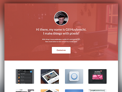
    So here is a possible design for a new portfolio for 2013 :)

    100% VIEW

    What do you guys think :)

    stay updated

    EDIT: inspired by oykun

    3 months ago

  2. Pro James Fletcher James Fletcher

    No! I make things with pixels! :P

    likes

    3 months ago

  3. Pro Falko Joseph Falko Joseph

    The red tint looks great dude! Nice cap btw :P

    Edit: it does indeed look better than the current one, can't wait to see how this turns out.

    likes

    3 months ago

  4. Pro Justin Graham Justin Graham

    Clean and simple w/ lots of negative space seems to be the trend of this year...Looks awesome non the less!

    likes

    3 months ago

  5. Pro Jim Silverman Jim Silverman

    looks incredibly similar to @oykun's – http://drbl.in/gCEt

    likes

    3 months ago

  6. Pro Gil Gil

    @James Fletcher haha lol :p

    @Falko Joseph haha thanks dude :D

    @Justin Graham thanks :D think its gonna be a big trend indeed :)

    @Jim Silverman oykun's design was great inspiration for my design! he's a great designer

    likes

    3 months ago

  7. Pro Tobia Crivellari  Tobia Crivellari 

    Nice man! ;-)

    likes

    3 months ago

  8. Pro Gil Gil

    @Tobia Crivellari ™ thnks mate! en thanks for the tweet :D

    likes

    3 months ago

  9. Pro Nathan Yates Nathan Yates

    @Gil Gotta be said, I think it looks great and I love the palette but the first thing I though was 'This looks like the folio that @Oykun posted a few days back',

    That being said, Im not your target user so I'm not sure it matters, something to think about though?

    3 months ago

  10. Pro Gil Gil

    @Nathan Yates like I said before, it was a great inspiration, but if change the color of the top let's say to blue, i'm pretty shure no one would say that, his header was a great inspiration, but my layout is different, and about the color. I realy love this color so i think i'm not gonna change it :) glad you liked it

    likes

    3 months ago

  11. Pro Tobia Crivellari  Tobia Crivellari 

    ;-)

    likes

    3 months ago

  12. Pro Nathan Yates Nathan Yates

    @Gil Exactly, Like I said, I'm not your user & Im pretty sure your users aren't going to look at your website and have the same first reaction as me.

    Right on for following your instinct & sticking with the colors!

    likes

    3 months ago

  13. Pro Bobby Giangeruso Bobby Giangeruso

    Nice job @Oykun :)

    likes

    3 months ago

  14. Pro Oykun Oykun

    likes

    3 months ago

  15. Pro Alex Alex

    Wow, loving that background image with the red tint! I had the same idea for my portfolio, but I just couldn't get it to work right! Nice job!

    3 months ago

  16. Pro Ryan Murphy Ryan Murphy

    Its nice, but if its very generic. It doesn't tell an employer that you are a creative guy (which you definitely are).

    3 months ago

  17. Pro Anthony Aubertin Anthony Aubertin

    3 months ago

  18. Pro Bruno Felicio Bruno Felicio

    I would loose the circle with the photo and just keep the background photo.

    likes

    3 months ago

  19. Pro Georgiy Tokarev Georgiy Tokarev

    Wow) Cool!

    likes

    3 months ago

  20. Pro Gil Gil

    @Bobby Giangeruso ⚒ you're quite the funny man, remember the time you uploaded a shot that looked 100% exactly the same like mine? good times ;)

    @Alex thanks for the suport dude! appreciate it!

    @Ryan Murphy i see what you mean, i'm gonna take a look at it :) thanks for support :)

    @Bruno Felicio thanks for the tip :)

    @Georgiy Tokarev thanks very much!

    likes

    3 months ago

  21. Abhimanyu Rana Abhimanyu Rana

    Nice header. :)

    likes

    3 months ago

  22. Gauthier Eloy Gauthier Eloy

    Stop whining guys... we don't care about who inspired who, or who copied who... take the best from both design to make it better and enhance your ideas, that's all ! Graphic design is all about watching what others do... this is why we are on Dribbble no ? ;) peace

    And btw, Gil's logo is made of same red for a long time, so this may be legitimate

    likes

    3 months ago

  23. Pro Gil Gil

    @Abhimanyu Rana thanks mate!

    @Gauthier Eloy couldn't say it better mate! thanks for the support!

    likes

    3 months ago

  24. Pro Daryl Ginn Daryl Ginn

    I don't think it's that similar, only the red.

    likes

    3 months ago

  25. Pro Kuldar Kuldar

    Must say, your current site gives a better overview of your work. Also, mimicking someone elses site feels bit shallow as well.

    likes

    3 months ago

keyboard shortcuts: previous shot next shot L or F like