Touch

13 Responses

  1. Pro Helvetic Brands Helvetic Brands

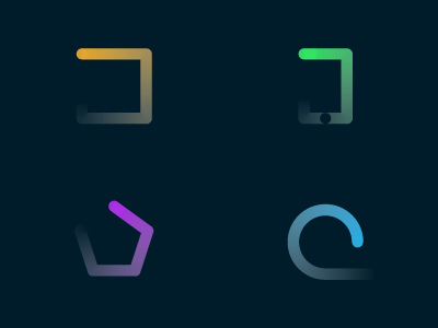
    Work in progress of the branding and sub branding of local company involved in UI and development. Inspired by drawing in the sand.
    Themes here are development, HTML5, mobile & cloud services.

    We would love to know your thoughts.

    Created by the Helvetic Brands team.

    4 months ago

  2. Andrew Colin Beck Andrew Colin Beck

    Love it!

    likes

    4 months ago

  3. Sam Mearns Sam Mearns

    Lovely... *****

    likes

    4 months ago

  4. Chris Lee Chris Lee

    These look like they could make some neat loading animations.

    likes

    4 months ago

  5. Pro Martin Hudobivnik Martin Hudobivnik

    Achtung Die Kurve v3.0? :D

    likes

    4 months ago

  6. Pro Oscar Morris Oscar Morris

    These are great. They also remind me of gestures.

    I think the green one would be better without the small circle.

    likes

    4 months ago

  7. Pro Ana Kova Ana Kova

    ahhhh. love it.

    likes

    4 months ago

  8. Pro Coleman Tharp Coleman Tharp

    Lovely work.

    likes

    4 months ago

  9. Justin Ellis Justin Ellis

    Nice. I agree with Oscar about the green icon being better without the small circle.

    likes

    4 months ago

  10. Louis Harboe Louis Harboe

    Cool concept. I also agree: get rid of the small circle.

    likes

    4 months ago

  11. Pro Jeremiah Wingett Jeremiah Wingett

    So awesome.

    likes

    4 months ago

  12. Francisco Seiz Freitas Francisco Seiz Freitas

    The bottom right shape is the odd one out - the line fades out and away from the shape, whereas, on the other shapes it fades out but continues on the same path of the shape..

    likes

    4 months ago

  13. 3 months ago

keyboard shortcuts: previous shot next shot L or F like