Find designers
Designer search
Quickly find your next designer
Post a job
The #1 job board for design talent
Inspiration
Courses
UX Diploma
Learn UX design from scratch in 6 months
UI Certificate
12-week UI skill building for designers
Live interactive workshops
with design professionals
Jobs
Go Pro
Log in
Dribbble: the community for graphic design
Log in
Sign up
NT logo progress
Samuel Horn af Rantzien
Follow
Following
Like
#6AB2CC
#8DCDE4
#7DC1DA
#3B86A5
#F1F8FA
Download color palette
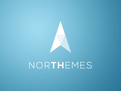
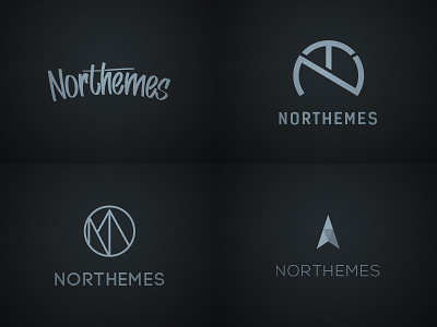
A progress on the sketch from last night! x2 avaliable!
Rebound of
Northeme logo progress
By
Samuel Horn af Rantzien
logo
sketch
vector
wip
View all tags
Posted on Feb 3, 2013
1,490
1
18
2
View feedback
Samuel Horn af Rantzien
More by Samuel Horn af Rantzien
View profile
Previous
Next
Loading…