Find designers
Designer search
Quickly find your next designer
Post a job
The #1 job board for design talent
Inspiration
Courses
UX Diploma
Learn UX design from scratch in 6 months
UI Certificate
12-week UI skill building for designers
Live interactive workshops
with design professionals
Jobs
Go Pro
Log in
Dribbble: the community for graphic design
Advance your career with a Professional Diploma in UX Design
Learn more
Log in
Sign up
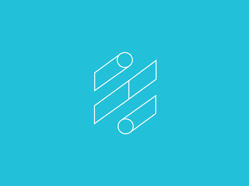
Percentage Logo
Bill Kenney
for
Focus Lab
Available for work
Follow
Following
Like
Get in touch
#23C0DA
#F8FDFE
#9FE4EF
#5ED1E4
Download color palette
%
Created with the Focus Lab team
branding
clean
design
financial
focus lab
geometric
icon
logo
mark
percentage
simple
View all tags
Posted on Feb 1, 2013
7,591
7
81
8
View feedback
Focus Lab
Be the brand that customers want and competitors envy.
Get in touch
More by Focus Lab
View profile
Previous
Next
Loading…
Loading…
Loading…