Evernote Webclipper

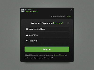
A while back I was working with the talented people over at Evernote, came up with a new ux concept and some updated graphics of their Web Clipper plugin. Here is a dark version. Check out @2x version for details.
A while back I was working with the talented people over at Evernote, came up with a new ux concept and some updated graphics of their Web Clipper plugin. Here is a dark version. Check out @2x version for details.


