


Web Typography

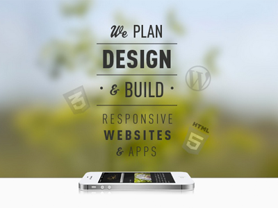
This improved concept was to have the elements bursting out of the phone - like the tree behind it that is blurred out, with the elements extending like branches.
This is the mobile header of my new business website, after spending all day re-working this responsive, I'm finally really happy with it.
I would love some constructive criticism that could help me improve this further. Thanks for the previous comments on my rebound before this, I removed it as to not flood Dribbble with to much of the same shit, not quite sure what the etiquette is there?


