New Site In The Works

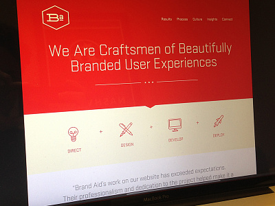


Home page comp for our new website and identity rollout eventually. Working hard to keep things as simple as possible and constantly striving to never underestimate the importance of clarity.
Home page comp for our new website and identity rollout eventually. Working hard to keep things as simple as possible and constantly striving to never underestimate the importance of clarity.


