Booklet

Booklet_1

1 Attachment

19 Responses

  1. Pro Artua Artua

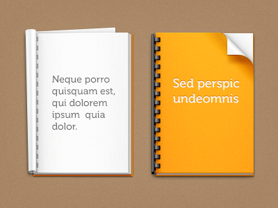
    One of our latest projects required the design of some booklets. Here are 2 versions.
    What do you think about them?

    PS. The high resolution versions is in the attachment.

    4 months ago

  2. Pro Bady Bady

    like the right one

    likes

    4 months ago

  3. Daniil Vnoutchkov Daniil Vnoutchkov

    Love the reflections!

    4 months ago

  4. Pro Edwin Delgado Edwin Delgado

    Not a fan of the text. But man... lot's of great details I like when seen big :)

    likes

    4 months ago

  5. Pro Liam McKay Liam McKay

    I think they look perfect - really well done.

    4 months ago

  6. Pro Yummygum Yummygum

    Sweet!

    4 months ago

  7. youri roggeveen youri roggeveen

    wow

    4 months ago

  8. Pro Ollin Ollin

    Depends on the background color. If it's a dark, colored background, use the left. If it's a white or otherwise muted, grayscale background, the right is definitely the better choice.

    I feel like you might be able to do more with the cover of the booklets, to show precisely what they are for [design, writing, whatever, you could have some vector icons or designs printed on]. Maybe the text is a placeholder and the actual covers are not revealable?

    likes

    4 months ago

  9. Pro Filip Santa Filip Santa

    sickness

    4 months ago

  10. Pro Tobia Crivellari  Tobia Crivellari 

    WOW!!

    4 months ago

  11. Tomas Laurinavicius Tomas Laurinavicius

    Details!

    4 months ago

  12. Burnt Toast Creative Burnt Toast Creative

    Geez, this is superb.

    4 months ago

  13. Pro Rich Smith Rich Smith

    The one of the left is a little bit different, seen the style on the right many times before :) both well executed as always!

    4 months ago

  14. Pro Zaib Ali Zaib Ali

    very simple and clean and BG doesn`t look good enough.

    4 months ago

  15. Pro Mitya Neradzinsky Mitya Neradzinsky

    cool

    4 months ago

  16. Pro Dreamix Studio Dreamix Studio

    Great work Artua!

    4 months ago

  17. Pro Walter Krivanek Walter Krivanek

    Really like your attention to detail!

    4 months ago

  18. Abdul Akbar Abdul Akbar

    what a detailed work. How you achieve that perfection???

    4 months ago

  19. thibaud thibaud

    This is wrong ! There's way more blades showing through the holes than it should (twice more blades inside than on the borders).
    ;)

    4 months ago

keyboard shortcuts: previous shot next shot L or F like