Badoo Messages Page and Chat Screen

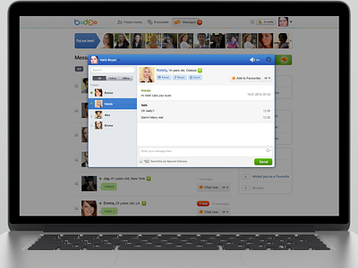


Hi dribbblers! I have a work to show you. It's a test task to improve a message page for Badoo I was made before. So now, we have a page easy to navigate, ability chatting with new people and fell in love with beautiful girls or boys ;) Check the "real pixel" to view.


