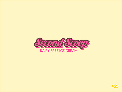
27/50 Daily Logo Challenge | Ice Cream - Second Scoop
Day 27 of the Daily Logo Challenge.
Prompt: Ice Cream
Company: Second Scoop
Bit of a generic submission today while I get my eye back in on this challenge and working to a 75 minute time limit. I managed to make one day past half way last year, determined to complete it and more during the next 12 months.
As said todays design is fairly self explanitory. Colours inspired by the classic three flavours of ice cream (strawberry, vanilla and chocolate). A rounded script font is used to keep the logo feeling friendly, smooth and flowing. I've used a rounded sans-serif for the sub-text to compliment the logotype and increase legibility at the small size. In hindsight however I probably should have gone with a handwritten font to give the design more personality and only after uploading did I notice the gaps in the brown stroke on the 'c's I will have to take more care in the future submission not to let small oversights like that get through.
All comments or questions welcome,
roast my design below.


