This would be beautiful letterpressed! It may be interesting to loose the digital on the revered section since it looks like you have a descriptive tagline below.
Just a thought, but I love the simplicity! Great job.
@Jared - Thanks for the comment :-) I've been wondering about this myself, and while the 'fifty' does look great on its own, I think I really need to introduce my business with its full name. Still not 100% decided though...
7 Responses
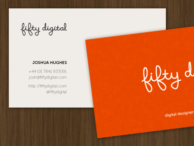
First application of the new logotype. Hoping to get these letterpressed in time for http://newadventuresconf.com.
over 2 years ago
Nice work Joshua. You've inspired me to do a little (re)branding now ;-)
over 2 years ago
This would be beautiful letterpressed! It may be interesting to loose the digital on the revered section since it looks like you have a descriptive tagline below.
Just a thought, but I love the simplicity! Great job.
over 2 years ago
@Jared - Thanks for the comment :-) I've been wondering about this myself, and while the 'fifty' does look great on its own, I think I really need to introduce my business with its full name. Still not 100% decided though...
over 2 years ago
These look great Josh! Looking forward to grabbing one from you at New Adventures.
over 2 years ago
Josh what script type did you use? I really like it. Very simple clean design. I love the color scheme choice. Great shot!
about 2 years ago
@Joshua — Thanks for the kind comments. The logotype is entirely hand-drawn. Based on the cursive I learnt at school as a kid ;-)
about 2 years ago