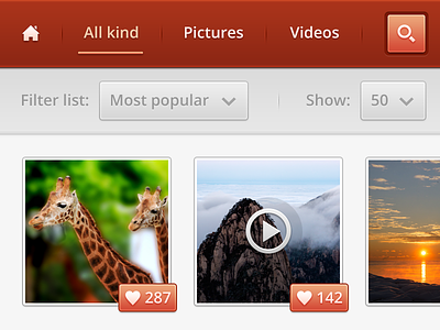
7 Responses

  1. Pro Dennis Covent Dennis Covent

    A little interface!

    Share your thoughts with me guys :-)

    My Twitter

    Edit: Dribbble makes it really fuzzy/blurry on non-retina screens :(. So check out the @2x view!

    likes

    4 months ago

  2. Pro Huig van der Waal Huig van der Waal

    Go easy on the inner glow :)

    4 months ago

  3. Pro Rodrigo Grundig Rodrigo Grundig

    I think those 2px border strokes are cheating my eyes into thinking they're 1px blurry.
    I'd give a bit more contrast to the txt on the gray row too.

    4 months ago

  4. Pro Dennis Covent Dennis Covent

    @Huig van der Waal I like it :-)
    @Rodrigo Grundig Check my edit in my comment! (@2x is way better)

    4 months ago

  5. Pro Sergey Valiukh Sergey Valiukh

    Great interface!

    4 months ago

  6. Pro Falko Joseph Falko Joseph

    I have to say it looks way better on a retina device (obvious, lol). Nice work man. :)

    4 months ago

  7. Pro Devin Ruppert Devin Ruppert

    Nice man. Loving that current tab selected underline.

    4 months ago

keyboard shortcuts: previous shot next shot L or F like