Find designers
Designer search
Quickly find your next designer
Post a job
The #1 job board for design talent
Inspiration
Courses
UX Diploma
Learn UX design from scratch in 6 months
UI Certificate
12-week UI skill building for designers
Live interactive workshops
with design professionals
Jobs
Go Pro
Log in
Dribbble: the community for graphic design
Log in
Sign up
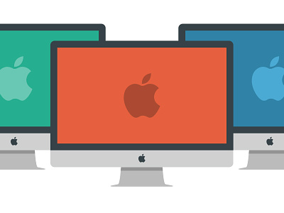
Flat2
Jonathan Atkinson
Follow
Following
Like
#F6F6F6
#E65F3F
#2B989B
#374449
#B2B3B3
#59B9C4
#B14C34
Download color palette
following on with the flat feel a few iMacs
Rebound of
Flat1
By
Jonathan Atkinson
apple
blue
flat
green
gui
icons
imac
red
View all tags
Posted on Jan 28, 2013
1,080
4
42
3
View feedback
Jonathan Atkinson
More by Jonathan Atkinson
View profile
Previous
Next
Loading…