Made in Amsterdam navigation

15 Responses

  1. Michiel de Graaf Michiel de Graaf

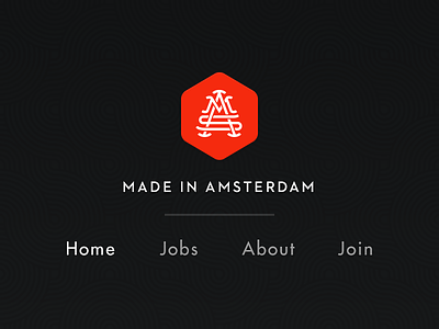
    This weekend I've been working on a little side project. Made in Amsterdam is basically a collection of tech companies building products in Amsterdam.

    I've tried a bunch of different stuff for the header and navigation and I kinda like how this turned out. What do you think?

    4 months ago

  2. Silviana Cosma Silviana Cosma

    Not sure about that middle line, but I do love the pattern in the background and the colors.

    likes

    4 months ago

  3. Pro Thomas Schrijer Thomas Schrijer

    Like it, but I guess I have to see the total picture to have a real opinion.

    likes

    4 months ago

  4. Pro Sergio Ruiz Sergio Ruiz

    Looks good! But personally I don't like the relief on the separator and navigation text, and maybe I'd try with another font for the navigation.

    likes

    4 months ago

  5. Pro Joel Helin Joel Helin

    I think you're going to make something badass out of this. Still loving that mark. Release it nooow!

    likes

    4 months ago

  6. Pro Rob Smittenaar Rob Smittenaar

    Love the logo.. just awesome !!

    likes

    4 months ago

  7. Stéphane Reverdy Stéphane Reverdy

    I say don't move an inch of this bitch

    likes

    4 months ago

  8. B3rto B3rto

    active button on red?

    4 months ago

  9. Pro Nuruzzaman Sheikh Nuruzzaman Sheikh

    Amazing works and the colors are outstanding!

    likes

    4 months ago

  10. Pro Avinash Tripathi Avinash Tripathi

    show more :)

    likes

    4 months ago

  11. Pro Daniel Klopper Daniel Klopper

    Rad!

    likes

    4 months ago

  12. Alfred Xing Alfred Xing

    Nice work!
    I would suggest removing the separator (or at least making it full width, across the page), and making the navigation smaller in proportion to the logo text (either make the logo bigger or navigation smaller)

    4 months ago

  13. Pro Daniel Howells Daniel Howells

    Dribbble comments are so weird.

    Keep the separator, keep the fonts the same, just keep on going.

    K thx.

    likes

    4 months ago

  14. Michiel de Graaf Michiel de Graaf

    Thanks all! I'll tweak some stuff as I move further with the front-end :).

    4 months ago

  15. Pro Kris de Jong Kris de Jong

    Mayb use uppercase text :) Love the style btw!

    3 months ago

keyboard shortcuts: previous shot next shot L or F like