I was gonna critique, cause when It was loading the top-bar gave me a weird feeling.
But everything just got insanely better, seeing how well it looks together with the rest of the UI. Plus, that plate is just fucking spot on. I love this.
@Axel Bouaziz Yeah, just noticed the graph looks pretty much the same, I might change this.
Why do you think the typography on the plate should be changed? It's actually the real font they are using for these plates and since I wanted to make them look realistic I thought it would be the best to use this one.
@Ivo Mynttinen When I compare your plate to a photography, yours typography seems to be straight whether photography tends to present subtle rounded corners on each letters.
@Axel Bouaziz I think it's pretty much the same, take a look at this one and compare the "F" and "7". However, even if not 100% the same I guess it's enough to achieve the right look&feel ;)
9 Responses
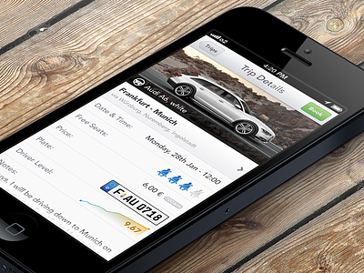
Design for a car sharing appliation (iOS). Real pixels attached.
Designed with Sketch 2.0 and filmed it: http://www.youtube.com/watch?v=XwOOZ6x4S5s
5 months ago
I was gonna critique, cause when It was loading the top-bar gave me a weird feeling.
But everything just got insanely better, seeing how well it looks together with the rest of the UI. Plus, that plate is just fucking spot on. I love this.
5 months ago
Just awesome guys ! Love your work
5 months ago
@Raul Rincon @Visualia ⟁ Thanks guys!
@Mato Haste recht :)
5 months ago
Really nice Ivo, as usual !
Driver level makes me think about Mashable "velocity graph" which is visible on each blog post.
My two cents :
- use a slightly darken grey for the occuped seat and distance background
- modify typography and outline on the license plate
5 months ago
@Axel Bouaziz Yeah, just noticed the graph looks pretty much the same, I might change this.
Why do you think the typography on the plate should be changed? It's actually the real font they are using for these plates and since I wanted to make them look realistic I thought it would be the best to use this one.
5 months ago
@Ivo Mynttinen When I compare your plate to a photography, yours typography seems to be straight whether photography tends to present subtle rounded corners on each letters.
But maybe it's my eyes ;)
5 months ago
@Axel Bouaziz I think it's pretty much the same, take a look at this one and compare the "F" and "7". However, even if not 100% the same I guess it's enough to achieve the right look&feel ;)
5 months ago
@Ivo Mynttinen Yep, effectively in your photo it looks very similar.
5 months ago