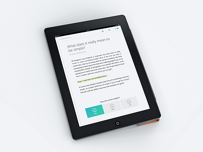
Working on the gibbon article detail screen. At the bottom of every article we will ask the user/reader if it was helpful... but not so sure if this works. What do you think?
More info about the gibbon concept: gibbon.co
I do tweet.