@Ido Vock, Really, I think quite the opposite. I chose wood over a black because the icon needed more color. I tried making the note black, but that clashes with the black keys.
@Michael Green I see what you mean, but when compared beside the rest of the theme, if actually fits. Here's what it looks like without the note. http://cl.ly/MQ7e
@Adam Jedrzejewski I'm not quite sure what you mean by "Is it readable on iPhone screen".
7 Responses
Pro
Morgan Carmont
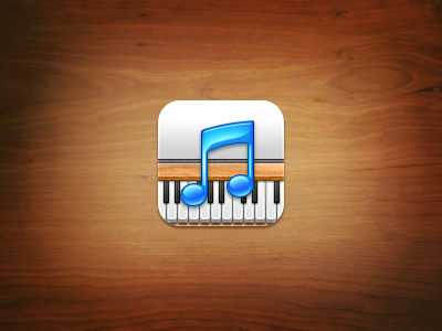
Got another icon for Altum here, tell me what you think! :)
4 months ago
Looks good but the blue of the note clashes with the wood, although it's not nearly as bad as it could be. Nice job!
4 months ago
is it "readable on iPhone screen ?
4 months ago
Graphically it's really nice, they'd make two really nice icons separately but the music note on top of an already busy icon is a bit too much imo.
4 months ago
Pro
Morgan Carmont
@Ido Vock, Really, I think quite the opposite. I chose wood over a black because the icon needed more color. I tried making the note black, but that clashes with the black keys.
@Michael Green I see what you mean, but when compared beside the rest of the theme, if actually fits. Here's what it looks like without the note. http://cl.ly/MQ7e
@Adam Jedrzejewski I'm not quite sure what you mean by "Is it readable on iPhone screen".
4 months ago
Pro
Sebastian Hager
The note looks gorgeous to me.
4 months ago
Rebound
Wat
by balderoine
Just a simple illustration :)
4 months ago