I second that on the use of color... I have always found yellow and gold a really difficult color to use and make elegant over garish... success on that Mr Ruane~
Slick layout and lovely theme. That text field doesn't look like a text field, though. I saw this and initially thought it was a badge with no interactivity.
@James Madson This product itself is not related to brewing. Our team is comprised of homebrewers/beer lovers though so we drew a lot of correlations between what we're building and the brewing process and figured to just run with it.
@Ted Goas Thanks for the feedback - it makes perfect sense. The interaction with the input field was set up that way intentionally, to give a sneak peek of sorts into the product itself. But, perhaps it isn't obvious enough. Will monitor that closely!
9 Responses
Pro
Kyle Ruane
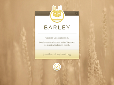
A little teaser page for something I've been working on - hoping to get it out into people's hands soon.
http://getbarley.com
4 months ago
Pro
Phil Lester
Beautiful colors and feel to this.
4 months ago
Pro
Marc Mendell
I second that on the use of color... I have always found yellow and gold a really difficult color to use and make elegant over garish... success on that Mr Ruane~
4 months ago
Pro
James Madson
homebrewing?? looks beautiful!
4 months ago
Pro
Ted Goas
Slick layout and lovely theme. That text field doesn't look like a text field, though. I saw this and initially thought it was a badge with no interactivity.
4 months ago
Pro
Kyle Ruane
Thanks guys!
@James Madson This product itself is not related to brewing. Our team is comprised of homebrewers/beer lovers though so we drew a lot of correlations between what we're building and the brewing process and figured to just run with it.
@Ted Goas Thanks for the feedback - it makes perfect sense. The interaction with the input field was set up that way intentionally, to give a sneak peek of sorts into the product itself. But, perhaps it isn't obvious enough. Will monitor that closely!
4 months ago
Pro
Dreamix Studio
Great work Kyle!
4 months ago
Definitely digging the functionality of that email input. Yes, it could use a visual or text cue that it is an input field.
The earthy tones are quite soothing. The icon reminds me of something from WDW's EPCOT or Wall•E. Overall a nicely done page.
4 months ago
@Michael Kovalchick @Ted Goas Thanks for the feedback!
4 months ago