Find designers
Designer search
Quickly find your next designer
Post a job
The #1 job board for design talent
Inspiration
Courses
UX Diploma
Learn UX design from scratch in 6 months
UI Certificate
12-week UI skill building for designers
Live interactive workshops
with design professionals
Jobs
Go Pro
Log in
Dribbble: the community for graphic design
Log in
Sign up
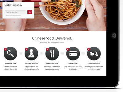
Chinese food. Delivered.
Carl Spencer
Follow
Following
Like
#FAF9F9
#090809
#C6ABA4
#9C6456
#58423D
#CB9162
#7C6F89
Download color palette
mobile
mobile first
responsive
View all tags
Posted on Jan 22, 2013
1,194
2
26
1
View feedback
Carl Spencer
More by Carl Spencer
View profile
Previous
Next
Loading…