Find designers
Designer search
Quickly find your next designer
Post a job
The #1 job board for design talent
Inspiration
Courses
UX Diploma
Learn UX design from scratch in 6 months
UI Certificate
12-week UI skill building for designers
Live interactive workshops
with design professionals
Jobs
Go Pro
Log in
Dribbble: the community for graphic design
Advance your career with a Professional Diploma in UX Design
Learn more
Log in
Sign up
New user menu
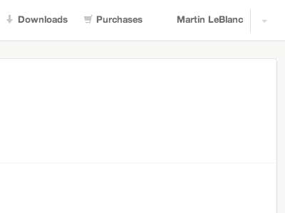
Martin LeBlanc
Follow
Following
Like
#FEFEFE
#A2A2A0
#70706E
Download color palette
Working on a new menu at the top with favorites, downloads and purchases.
iconfinder
View all tags
Posted on Jan 22, 2013
522
1
7
4
View feedback
Martin LeBlanc
More by Martin LeBlanc
View profile
Previous
Next
Loading…