Callback Rebound

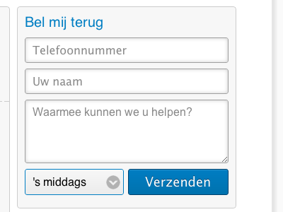
Rebound of previous callback form. The client wanted to let users add some additional information, but keep the form simple. This is the result. Note that this is a screenshot of a working site in development (html/css) and select is on active state. What do you think?