Find designers
Designer search
Quickly find your next designer
Post a job
The #1 job board for design talent
Inspiration
Courses
UX Diploma
Learn UX design from scratch in 6 months
UI Certificate
12-week UI skill building for designers
Live interactive workshops
with design professionals
Jobs
Go Pro
Log in
Dribbble: the community for graphic design
Log in
Sign up
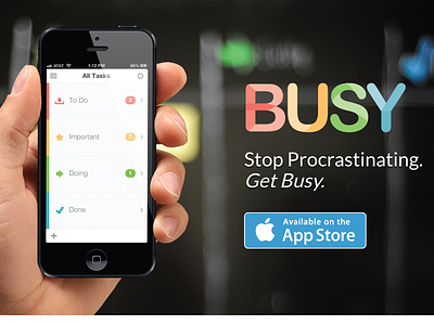
Get Busy App
Fedor Sosnin
Follow
Following
Like
#1B1B19
#FBFBFC
#4A4038
#5C5D5A
#DFB89C
#AD674E
#499EB6
#CB986E
Download color palette
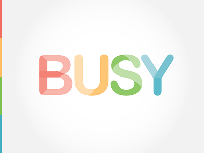
Worked on the Busy logo for
www.getbusyapp.com
. Check out the new App!
Rebound of
Busy 3
By
Fedor Sosnin
app
appstore
busy
getbusyapp.com
list
logo
todo
to do list
web
View all tags
Posted on Jan 22, 2013
3,636
4
32
5
View feedback
Fedor Sosnin
More by Fedor Sosnin
View profile
Previous
Next
Loading…