I think you might need more contrast between "lit" and "unlit" icons/list items [besides the toggles]–maybe have the text and background colors could get lighter as well?
@Ollin you're absolutely right regarding the bulb icon for on / off - the off should be darker. The only reason it is so light right now, is because the bulbs actually are quite bright off. I should be able to fix it though.
10 Responses
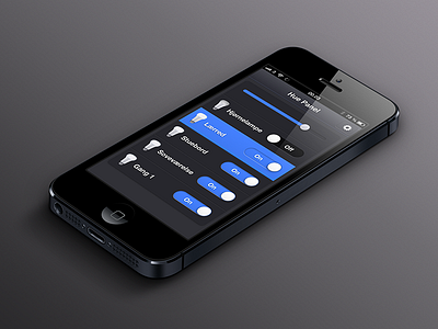
Light control view – actual screenshot from the webapp.
Non Hue Preview
Views, preview page
Hue Preview
Philips Hue, development page
4 months ago
Looks Great!
4 months ago
Very "to-the-point" and sleek. The only thing that springs to mind is, that the on/off toggles seem a tad too wide for my taste.
I'd use it ^_^
4 months ago
@Søren Horsbøll Hansen I agree - this screenshot was taken just after I implemented the switch controls in the view. They should be a tad narrower.
4 months ago
Pro
Ollin
I think you might need more contrast between "lit" and "unlit" icons/list items [besides the toggles]–maybe have the text and background colors could get lighter as well?
4 months ago
@Ollin you're absolutely right regarding the bulb icon for on / off - the off should be darker. The only reason it is so light right now, is because the bulbs actually are quite bright off. I should be able to fix it though.
4 months ago
Pro
Nathan Powell
lovely blue
4 months ago
Gosh, love the blue popping off of that dark grey!
4 months ago
@Ollin I've made the switches smaller, changed the backgrounds and updated the off bulb to be a tad darker
4 months ago
Pro
Tobia Crivellari
Love it!
4 months ago