Find designers
Designer search
Quickly find your next designer
Post a job
The #1 job board for design talent
Inspiration
Courses
UX Diploma
Learn UX design from scratch in 6 months
UI Certificate
12-week UI skill building for designers
Live interactive workshops
with design professionals
Jobs
Go Pro
Log in
Dribbble: the community for graphic design
Log in
Sign up
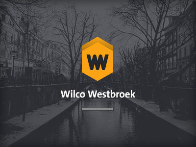
Logo Tryout
Wilco Westbroek
Available for work
Follow
Following
Like
Get in touch
#4F5055
#2D2E33
#F49F15
#D0D1D1
#A77625
#C28C27
Download color palette
Tryout for a new personal logo..
logo
tryout
utrecht
westbroek
wilco
yellow
View all tags
Posted on Jan 20, 2013
745
1
41
2
View feedback
Wilco Westbroek
Get in touch
More by Wilco Westbroek
View profile
Previous
Next
Loading…
Loading…
Loading…