Top left is what I think is best. The way I see it is, it's much easier for someone to recognise a box that needs to be filled in, than a line that they have to write above. This is both on the web, and when filling out forms on paper. And, the top left is the nicest in my opinion. Has that tiny bit of depth.
2 Responses
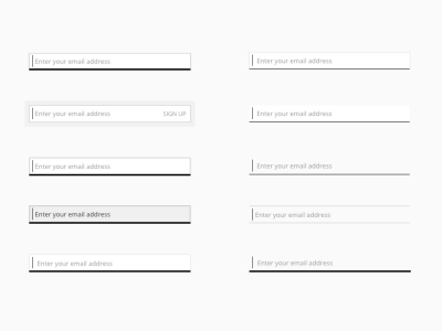
Further styling options for the Sign up form.
Presently leaning towards top right or bottom right...
Full pixels are attached.
5 months ago
Top left is what I think is best. The way I see it is, it's much easier for someone to recognise a box that needs to be filled in, than a line that they have to write above. This is both on the web, and when filling out forms on paper. And, the top left is the nicest in my opinion. Has that tiny bit of depth.
5 months ago