Find designers
Designer search
Quickly find your next designer
Post a job
The #1 job board for design talent
Inspiration
Courses
UX Diploma
Learn UX design from scratch in 6 months
UI Certificate
12-week UI skill building for designers
Live interactive workshops
with design professionals
Jobs
Go Pro
Log in
Dribbble: the community for graphic design
Log in
Sign up
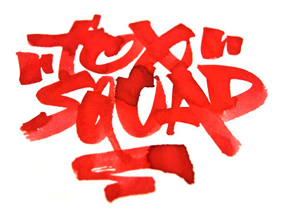
Foxsquad
Kostadin Kokalanov
Follow
Following
Like
#FFFEFE
#F0251A
#AB150D
#FB5951
#FBB0A0
Download color palette
Fat brush letters for fun.
brush
fat
letters
View all tags
Posted on Jan 20, 2013
600
4
42
6
View feedback
Kostadin Kokalanov
More by Kostadin Kokalanov
View profile
Previous
Next
Loading…