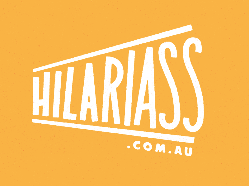
Fixed up a few elements I saw needing work in the previous shot. Notably the line weights of each letter - the increasing size of the letters created the illusion of them getting progressively thinner. So I subtly reduced the weight of the first few letters and increased the last few. Looks a bunch better.
Also played with positioning of the '.com.au' and the 'shoutout' bars above and below the type.
Lastly I played with the form of the 'S's so they filled in a little more empty space.
I think I'm nearly happy to lock it in as a final concept! Onto the laughing donkey concept...
2 Responses
Fixed up a few elements I saw needing work in the previous shot. Notably the line weights of each letter - the increasing size of the letters created the illusion of them getting progressively thinner. So I subtly reduced the weight of the first few letters and increased the last few. Looks a bunch better.
Also played with positioning of the '.com.au' and the 'shoutout' bars above and below the type.
Lastly I played with the form of the 'S's so they filled in a little more empty space.
I think I'm nearly happy to lock it in as a final concept! Onto the laughing donkey concept...
5 months ago
Hey Dave, really like the direction this is going. How is the donkey element coming along? I think how they work together will be the crux of this.
5 months ago