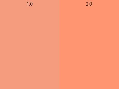
The Color Difference in 2.0
Here is an example of the increased saturation in 2.0. It makes everything pop and things look better. While it may seem like a small difference, it makes a huge difference while browsing the site.
Posted on
Jan 16, 2013
More by Hugo Kessler View profile
Like


