Although I really like it (it's very pretty), I think the real challenge is in solving all the usability problems the app has: using the tab bar for actions, no grid view on the feed, the commenting system and displaying, notification system…
Anyway, except for using Bello, I love the visual design you did! :)
@Jono: I was afraid to post that comment because of the popularity that this has been garnering and no one really raising the point. But the red nav bar draws too much attention away from the photograph. Also checked the blog just now and the same is true for the brown bottom nav. The problem of inconsistent use of tabs for action is what is my problem mainly.
It was a major reason why I did not choose to play a lot with the colors in the UI elements in my redesign of Instagram but rather focus the smaller conventions it breaks and improving the overall aesthetics without being a drastic change.
Also is it me or does Instagram actually not have any filters without a border as this photograph shows.
This is beautiful. My favorite feature is the rounded corners on the top red UINavBar - the screen is technically square, but you're giving the illusion of rounded by adding that black background in there to match the top bar. Awesome; I'll be stealing that idea :)
Although this is beautiful, I think it is quite arrogant to believe this will ever see the light of day as an actual redesign. In this redesign there are entire features that are missing without explanation, features that are used everyday by most users. The colors, icons and textures, although very attractive, are distracting and do nothing to support the core feature of this app.
Photos are the sole reason people are infatuated with this app. Unless I'm missing something, this design has only accomplished the opposite of what makes Instagram great.
I personally like the design. I love the use of textures. The red is a bit distracting but overall it has a nice feel to it.
An application like this would cost a ton to redo according to the design as you are now redesigning the tab icons at the bottom. Although it can be done it would be a major dev overhaul and these icons are not only used for point of navigation from a programmers view. This treatment is also a bit discouraged based on Apple's HIG.
As a conceptual design I give it 2 thumbs up though!!
Cute, pretty clean, overall really nice. However, I don't think it fits in with Instagram's retro theme. I also think that a design like this for a photos app is detracting, even slightly, from the app's actual, original purpose—photos!
Btw, did anyone notice the inconsistency of the App icon itself? Compare the icon on http://instagr.am/ with the icon on your iPhone. Why did they ever change it?
24 Responses
Pro
Robin Raszka
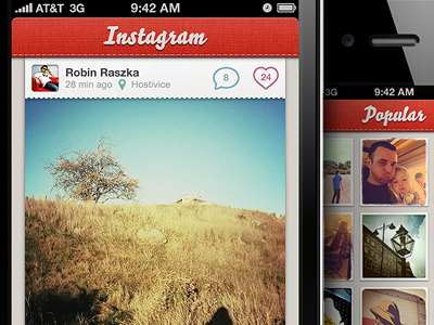
Read more: An Open Letter to Instagram
Click here to view full size.
UPDATE: To Clarify: http://t.co/bigg5RG
over 2 years ago
Pro
James ✌
Looks awesome :)
over 2 years ago
HAWT.
over 2 years ago
Awesome, great job.
over 2 years ago
Pro
Alberto Calvo
Although I really like it (it's very pretty), I think the real challenge is in solving all the usability problems the app has: using the tab bar for actions, no grid view on the feed, the commenting system and displaying, notification system…
Anyway, except for using Bello, I love the visual design you did! :)
over 2 years ago
I guess I must be the only one that doesn't like this whole red nav bar thing. I'd just like to see the app with more of a standard UI.
over 2 years ago
Pro
Tuhin Kumar
@Jono: I was afraid to post that comment because of the popularity that this has been garnering and no one really raising the point. But the red nav bar draws too much attention away from the photograph. Also checked the blog just now and the same is true for the brown bottom nav. The problem of inconsistent use of tabs for action is what is my problem mainly.
It was a major reason why I did not choose to play a lot with the colors in the UI elements in my redesign of Instagram but rather focus the smaller conventions it breaks and improving the overall aesthetics without being a drastic change.
Also is it me or does Instagram actually not have any filters without a border as this photograph shows.
over 2 years ago
Pro
Alberto Calvo
That's an interesting thought, @Jono and Tuhnin :)
over 2 years ago
Pro
Simon Gustavsson
Sweeeeeeeet!
over 2 years ago
Pro
Matt Olpinski
absolutely gorgeous.
over 2 years ago
Pro
Aurélien Foutoyet
WoOsh that's great :)
over 2 years ago
Looks gorgeous! I am waiting for the day that it comes to android!
over 2 years ago
Pro
Ryan Scherf
This is beautiful. My favorite feature is the rounded corners on the top red UINavBar - the screen is technically square, but you're giving the illusion of rounded by adding that black background in there to match the top bar. Awesome; I'll be stealing that idea :)
over 2 years ago
Pro
Steve Lowtwait
Not a fan of the color palette either, but this is certainly more polished than what they have now.
over 2 years ago
Pro
Matthew Skiles
I love it!!! Great textures, great icons, and in my opinion the color palette is excellent :)
over 2 years ago
Pro
Jarad Johnson
Although this is beautiful, I think it is quite arrogant to believe this will ever see the light of day as an actual redesign. In this redesign there are entire features that are missing without explanation, features that are used everyday by most users. The colors, icons and textures, although very attractive, are distracting and do nothing to support the core feature of this app.
Photos are the sole reason people are infatuated with this app. Unless I'm missing something, this design has only accomplished the opposite of what makes Instagram great.
over 2 years ago
I personally like the design. I love the use of textures. The red is a bit distracting but overall it has a nice feel to it.
An application like this would cost a ton to redo according to the design as you are now redesigning the tab icons at the bottom. Although it can be done it would be a major dev overhaul and these icons are not only used for point of navigation from a programmers view. This treatment is also a bit discouraged based on Apple's HIG.
As a conceptual design I give it 2 thumbs up though!!
over 2 years ago
Cute, pretty clean, overall really nice. However, I don't think it fits in with Instagram's retro theme. I also think that a design like this for a photos app is detracting, even slightly, from the app's actual, original purpose—photos!
over 2 years ago
Just lovely!
Btw, did anyone notice the inconsistency of the App icon itself? Compare the icon on http://instagr.am/ with the icon on your iPhone. Why did they ever change it?
over 2 years ago
that made me cry T_T !!
OUTSTANDING WORK !!
over 2 years ago
I'm flattered to find a photo I've taken: http://instagr.am/p/GOUL/ Nice work also :)
over 2 years ago
Oh my god. Please yes.
over 2 years ago
Rebound
Instagram Redesign (retina only)
by Mehdi Ibrahim
Download : http://idzr.org/6kdh
Instruction for Non-Jailbreak device are included !
Thanks to Robin Raszka and Jeff Broderick
Enjoy :)
over 2 years ago
Oh, how hard I wish Instagram would use this.
over 2 years ago