Find designers
Designer search
Quickly find your next designer
Post a job
The #1 job board for design talent
Inspiration
Courses
UX Diploma
Learn UX design from scratch in 6 months
UI Certificate
12-week UI skill building for designers
Live interactive workshops
with design professionals
Jobs
Go Pro
Log in
Dribbble: the community for graphic design
Log in
Sign up
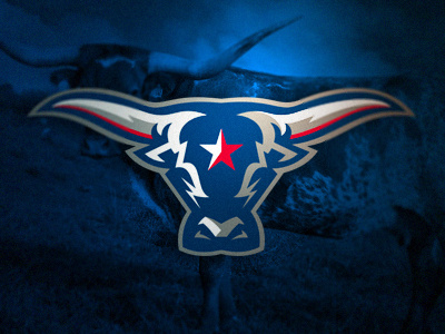
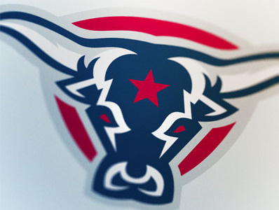
Longhorns
Zilligen Design Studio
Available for work
Follow
Following
Like
Get in touch
#021427
#025295
#C7C7C2
#5E6162
#0E73C6
#92566D
Download color palette
Another revision of an older logo for the project.
Rebound of
Davidson's Tutorial Take 2
By
Zilligen Design Studio
football
houston
logo
longhorns
revision
sports
ufl
View all tags
Posted on Jan 15, 2013
3,290
14
76
7
View feedback
Zilligen Design Studio
A mighty sports branding studio.
Get in touch
More by Zilligen Design Studio
View profile
Previous
Next
Loading…
Loading…
Loading…