Find designers
Designer search
Quickly find your next designer
Post a job
The #1 job board for design talent
Inspiration
Courses
UX Diploma
Learn UX design from scratch in 6 months
UI Certificate
12-week UI skill building for designers
Live interactive workshops
with design professionals
Jobs
Go Pro
Log in
Dribbble: the community for graphic design
Log in
Sign up
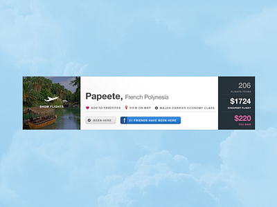
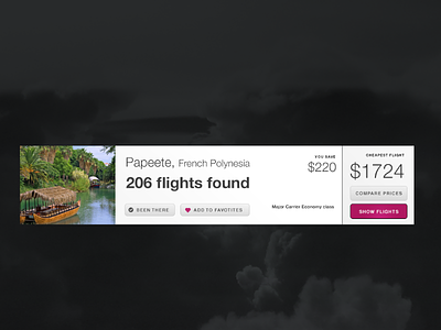
Destination Result 2
Joey Grillo
Follow
Following
Like
#AED9F2
#FAFBFB
#262F2D
#6B7FB5
#534E2D
#999BA1
#4870A4
Download color palette
Still seems a little off... any suggestions?
Rebound of
Destination result
By
Joey Grillo
buttons
clouds
results
rollover
sky
travel
ui
View all tags
Posted on Jan 15, 2013
2,505
14
45
3
View feedback
Joey Grillo
Welcome to my design portfolio on Dribbble
More by Joey Grillo
View profile
Previous
Next
Loading…