Fashio Dashboard


Howdy,
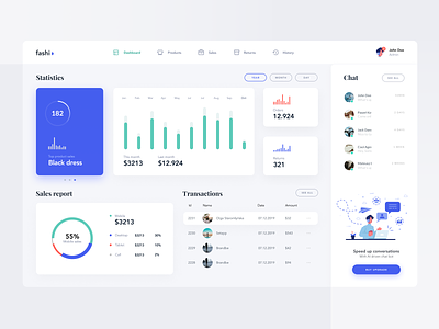
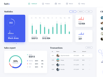
After a long break, I decided to come with some slightly different. I wanted to combine minimalistic look with a sherif font to make it look more posh. The dashboard itself is simple but very useful at the same time - showing all the necessary stuff.
What do you think guys? Is there anything I could improve?
Tell me guys what do you think and as always share some love 🖤


