Find designers
Designer search
Quickly find your next designer
Post a job
The #1 job board for design talent
Inspiration
Courses
UX Diploma
Learn UX design from scratch in 6 months
UI Certificate
12-week UI skill building for designers
Live interactive workshops
with design professionals
Jobs
Go Pro
Log in
Dribbble: the community for graphic design
Log in
Sign up
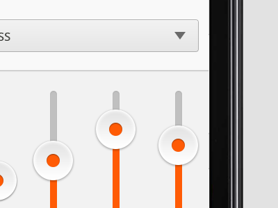
Sliders
Oykun Yilmaz
Available for work
Follow
Following
Like
Get in touch
#EFEFEF
#141415
#AAA9AB
#3E3D43
#FB5A06
#E9B397
#D29474
Download color palette
Some sliders for something...
Feedbacks are most welcome!
✌
@Oykun
android
app
dropdown
ios
mobile
nexus
orange
slider
ui
View all tags
Posted on Jan 15, 2013
8,578
14
141
12
View feedback
Oykun Yilmaz
Get in touch
More by Oykun Yilmaz
View profile
Previous
Next
Loading…
Loading…
Loading…