Find designers
Designer search
Quickly find your next designer
Post a job
The #1 job board for design talent
Inspiration
Courses
UX Diploma
Learn UX design from scratch in 6 months
UI Certificate
12-week UI skill building for designers
Live interactive workshops
with design professionals
Jobs
Go Pro
Log in
Dribbble: the community for graphic design
Advance your career with a Professional Diploma in UX Design
Learn more
Log in
Sign up
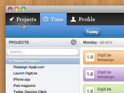
Digiti Back office
Digiti
Available for work
Follow
Following
Like
Get in touch
#ECEEF1
#BFBCBD
#343233
#C4925A
#5795D7
#4384BF
#A67345
#3472B1
Download color palette
The first glimpse of our new back office that will power the office starting next year
admin
backoffice
blue
digiti
projects
search
tabs
ui
View all tags
Posted on Dec 13, 2010
11,856
8
122
12
View feedback
Digiti
Get in touch
More by Digiti
View profile
Previous
Next
Loading…
Loading…
Loading…