Fixelgraphy

Logo design for Fixelgraphy. I’m really pleased and happy about how the final iteration has turned out. I didn’t want to over-complicate things as logo design is not my forte. So I decided to make use of basic shapes and lines.
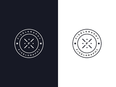
The ‘F’ alphabet represents Fixelgraphy. It is also the initial of my second name. The ‘X’ shape around the alphabet represents ‘spark’. And then there are four stars together with the spark. ✨
Just a combination of my favourite things that made up my logo — stars, spark, simplicity and minimalism. A simple story behind my logo. ✌️


