Find designers
Designer search
Quickly find your next designer
Post a job
The #1 job board for design talent
Inspiration
Courses
UX Diploma
Learn UX design from scratch in 6 months
UI Certificate
12-week UI skill building for designers
Live interactive workshops
with design professionals
Jobs
Go Pro
Log in
Dribbble: the community for graphic design
Log in
Sign up
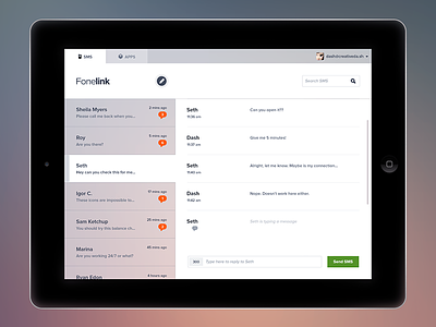
Fonelink
UI8
Available for work
Follow
Following
Like
Get in touch
#F2EFF1
#050505
#6D7483
#BB9993
#977476
#3B3C45
#9E8473
Download color palette
UI design for an SMS tool we are working on. Full view attached.
button
buttons
graphic design
ipad
iphone
mobile
ui
View all tags
Posted on Jan 9, 2013
11,404
47
325
21
View feedback
UI8
Design studio / Resources for designers.
Get in touch
More by UI8
View profile
Previous
Next
Loading…
Loading…
Loading…