Find designers
Designer search
Quickly find your next designer
Post a job
The #1 job board for design talent
Inspiration
Courses
UX Diploma
Learn UX design from scratch in 6 months
UI Certificate
12-week UI skill building for designers
Live interactive workshops
with design professionals
Jobs
Go Pro
Log in
Dribbble: the community for graphic design
Log in
Sign up
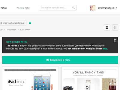
UnRoll me header
Kyee
Available for work
Follow
Following
Like
Get in touch
#F9F9F9
#2E2E2E
#07C6A8
#B1C4CA
#C9B598
#5C5F61
#9F9D99
#48857C
Download color palette
The dashboard view coming together!
Check out the full pixels!
application
green
grey
helvetica
icons
teal
tooltip
ui
unrollme
user interface
web app
whitespace
View all tags
Posted on Jan 8, 2013
11,771
34
216
12
View feedback
Kyee
Get in touch
More by Kyee
View profile
Previous
Next
Loading…
Loading…
Loading…