Designer News Badges

34 Responses (page 1 of 2)

  1. Pro Allan Grinshtein Allan Grinshtein

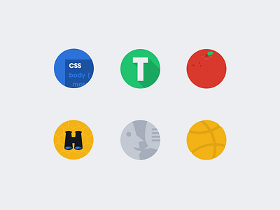
    These are badges and badge concepts for Designer News. From top left, in clockwise order:

    1. CSS-related posts

    2. Typography posts

    3. Any Apple-related post

    4. "Sweet find," which may or may not end up being used by admins.

    5. Discussions

    6. A yellow tennis-ball looking thing for dribbble posts.

    likes

    4 months ago

  2. Julian Leiss Julian Leiss

    Nice :)

    likes

    4 months ago

  3. Ernest Ojeh Ernest Ojeh

    @Allan Grinshtein Nice badges.. I'll like to point out that the icons on the site don't display properly in Firefox.

    4 months ago

  4. Pro Allan Grinshtein Allan Grinshtein

    @Ernest Ojeh I'm going to push out a few changes tonight after dinner to fix that. Firefox is lackluster when it comes to SVG rendering, unfortunately.

    4 months ago

  5. Pro Sorel Mihai Sorel Mihai

    The typography icon makes me think about TechCrunch. Otherwise, all are very sweet.

    likes

    4 months ago

  6. Victor Victor

    I like the details on the tennis ball !

    4 months ago

  7. Pro Evan Brooks Evan Brooks

    These look great - are you still handing out invites?

    4 months ago

  8. Ari Ari

    Yes.

    4 months ago

  9. Pro Allan Grinshtein Allan Grinshtein

    @Evan Brooks yup, just email me at allan@layervault.com

    4 months ago

  10. Pro Marc Nash Marc Nash

    love the color palette. nice work!

    likes

    4 months ago

  11. Pro Charles Riccardi Charles Riccardi

    Allan, these are awesome.

    likes

    4 months ago

  12. Pro wesley lauka wesley lauka

    These are great, and look fantastic on the page! Awesome job with Designer News!

    likes

    4 months ago

  13. Jocelyn Richard Jocelyn Richard

    The badges are very good, I like the art direction very much. My 2 cents: even though the "T" is technically centred in its disk, the dark green projection makes it look unbalanced. I'm not sure about the dribbble icon being yellow, but i *really* like the fact that it's actually carved out where it should be.

    likes

    4 months ago

  14. Pro Asher Simonds Asher Simonds

    The amount of flat these icons have is astoundingly awesome.

    Sent you an email a few days ago about an invite, but I figured you just had a backlog of excited invitees!

    4 months ago

  15. Pro Allan Grinshtein Allan Grinshtein

    @Asher Simonds for some reason, some requests keep getting caught in my spam filter. I'll reply now.

    4 months ago

  16. Pro Asher Simonds Asher Simonds

    4 months ago

  17. Pro Murat Mutlu Murat Mutlu

    I think the badges are really nicely designed but a real distraction on the site. I like the sweet find idea but more subtle and inline with the minimal look

    4 months ago

  18. Stefano Vetere Stefano Vetere

    so sweet!

    4 months ago

  19. Benjamin Parry Benjamin Parry

    These are terrific, i’m a big fan of the style and colour palette. I find icon design pretty hard and often rely on the tried and tested language. What I like about these is that they're unique in content and full of character and still subscribe to the brand aesthetic.

    Drooolin'

    4 months ago

  20. Pro Sam Jones Sam Jones

    These are looking good but I'm not sure about the colour of the apple and dribbble icon. It might just be me, but I think by having the apple icon in red it could get confused for a tomato, more so when you consider the shape of the icon. I also think the yellow of the dribbble icon is a bit too similar to "sweet find". I would probably go with an orange or pink just to make it even more distinguishable.

    Great work on Designer News by the way!

    4 months ago

  21. Julien Pelletier Julien Pelletier

    Nice badges ! I love Designer News.
    Why don't keep the pink color for Dribbble posts ?

    likes

    4 months ago

  22. Lin Je-We Lin Je-We

    I like this colorful badges

    4 months ago

  23. Pro Robert Cooper Robert Cooper

    These are great, but you're wrong to use a tennis ball for Dribbble. It would be like using an orange for Apple related posts. It should be a basketball or it makes no sense, and probably pink.

    4 months ago

  24. Pro Matías Calderón Bourband Matías Calderón Bourband

    I think it's actually a basketball, I have no problem with the color though I'm not sure if it relates to Dribbble.

    4 months ago

  25. Pro Matías Calderón Bourband Matías Calderón Bourband

    Other than that, these are sweet!

    4 months ago

keyboard shortcuts: previous shot next shot L or F like