Find designers
Designer search
Quickly find your next designer
Post a job
The #1 job board for design talent
Inspiration
Courses
UX Diploma
Learn UX design from scratch in 6 months
UI Certificate
12-week UI skill building for designers
Live interactive workshops
with design professionals
Jobs
Go Pro
Log in
Dribbble: the community for graphic design
Log in
Sign up
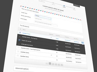
CakeMail Editor - WIP
Alexandre Deschamps
Follow
Following
Like
#F9F9F9
#464646
#A2A2A2
#ABC0E7
#B2738E
#2872B3
Download color palette
Real pixels.
button
cakemail
editor
email
fields
form
light
marketing
radio
rows
table
ui
View all tags
Posted on Jan 7, 2013
20,421
74
241
8
View feedback
Alexandre Deschamps
More by Alexandre Deschamps
View profile
Previous
Next
Loading…