4 Attachments

17 Responses

  1. Pro Chris Bannister Chris Bannister

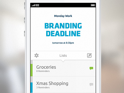
    A little side project I was working on before christmas just for fun, it's a simple list app but with a few niceties and added conveniences in there, the bars on the left are progress indicators.

    I'm thinking about whether to get it made so any feedback will be extremely useful and much appreciated.

    I'm reluctant to show the whole thing at the moment so theres a few first stage screens attached, check them out.

    And finally a shout out to @Adam Whitcroft for a couple of icons from batch.

    4 months ago

  2. Pro Avinash Tripathi Avinash Tripathi

    nice clean

    4 months ago

  3. Pro Jamie Heuze Jamie Heuze

    Nice one Chris I've been toying with something similar myself ;)

    4 months ago

  4. Achal Varma Achal Varma

    Very nice! :)

    4 months ago

  5. Jona Jona

    Great work, the bright and minimal style fits the context perfectly! I'd suggest moving those navbar icons (Settings/Compose) a bit more to the sides though, in order for them to have an equal distance to the bar's edges on both axes.

    4 months ago

  6. Pro Chris Bannister Chris Bannister

    @Avinash Tripathi @Jamie Heuze @Achal Varma thanks very much guys. @Jona Thanks very much, thats one of the things i played around with and with the sizing of the icons on the right and the progress bars on the left. This is where it seemed to be most balanced, I get what your saying though and i'll probably take a look at it with some fresh eyes now i've had some time away from it, cheers.

    4 months ago

  7. Pro Luka Cvetinovic Luka Cvetinovic

    Powerfull design!

    Perfect colors, very clean and minimalistic. Good fonts! In one word, AMAZING! ;)

    Keep it up! I am watching you!

    4 months ago

  8. Pro Sabri Suby Sabri Suby

    Beautiful! What fonts are used here?

    4 months ago

  9. Pro krishnachaitanya krishnachaitanya

    very clean :)

    4 months ago

  10. Pro Chris Bannister Chris Bannister

    @Sabri Suby There Ubuntu and Klavika, I wanted to use a couple of typefaces that suited and preferably ones that i've never used before.

    @krishnachaitanya Thanks very much.

    @Luka Cvetinovic Thanks very much mate, really appreciate the kind words.

    4 months ago

  11. Pro Sasha Agapov Sasha Agapov

    I kinda wish the typography on the list items themselves was a little bit lighter. The names of the project seem a bit too heavy now — changing that would help establish hierarchy more as well as bring in more aesthetics in the app.

    4 months ago

  12. Pro Sabri Suby Sabri Suby

    @Chris Bannister Thanks champ! It looks great, very simplistic!

    4 months ago

  13. Pro Ismet Ismet

    Nice app @Chris Bannister

    4 months ago

  14. Pro Chris Bannister Chris Bannister

    @Sasha Agapov Thats a good shout, they seem to stick out too me a little too much now you've mentioned it. I'll take a look at softening it a little. @Sabri Suby @Ismet Cheers very much guys.

    3 months ago

  15. Eric Zentner Eric Zentner

    soo... when can i start using it?

    '~'

    about 1 month ago

  16. Pro Chris Bannister Chris Bannister

    @Eric Zentner There's a few things i'll need to fix with it, a lot of UX and stripping things down. I also need to find a dev who wants to partner up on it. With any luck and if I can prove that enough people will find it useful I'll be able to get it out this year.

    about 1 month ago

  17. Eric Zentner Eric Zentner

    Well... keep us posted brother! Looks like it would be a pleasure to use.

    about 1 month ago

keyboard shortcuts: previous shot next shot L or F like