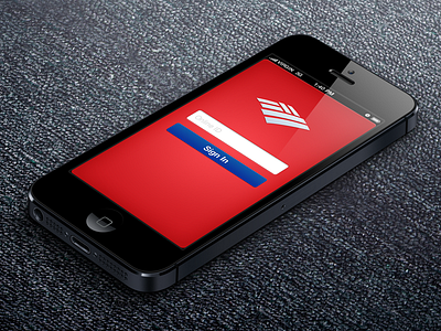
Bank of America Sign In And Accounts

19 Responses

  1. Pro Herson Rodriguez Herson Rodriguez

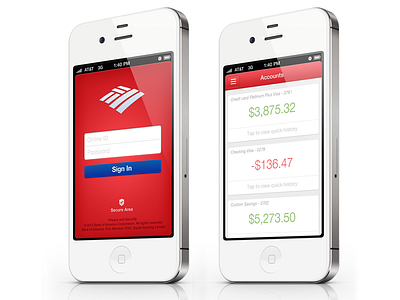
    Here is the updated sign in page and the new accounts page. Still not 100% finished with the accounts page but the basic idea is there.

    4 months ago

  2. Coard Miller Coard Miller

    Very clean. Something very different but familiar from the current app.

    likes

    4 months ago

  3. Pro Mike Cummings Mike Cummings

    Killer.

    likes

    4 months ago

  4. Corey Haggard Corey Haggard

    Sick dude!

    likes

    4 months ago

  5. Pro Herson Rodriguez Herson Rodriguez

    4 months ago

  6. Haydn Woods Haydn Woods

    Wow this is very nice! Lovely colour palette :)

    likes

    4 months ago

  7. Pro Olli Wiegner Olli Wiegner

    The accounts view is damn nice, very clean...but the sign in view is strange. I feel like the blue button doesn't fit in at all and maybe try to use grey on the text at the bottom.

    likes

    4 months ago

  8. Pro Herson Rodriguez Herson Rodriguez

    Thank you @Haydn Woods

    @Olli Wiegner Your the second person who saia that about the blue button. Ill give it a another try. Thanks :)

    likes

    4 months ago

  9. Pro kirk visola kirk visola

    Super simple and clean. The landing/sign in page had some stuff added to it on the bottom. Looks more official. Nice work.

    likes

    4 months ago

  10. Pro Joshua Pekera Joshua Pekera

    This looks fantastic. You need to give Wells Fargo a call. I'm tired of using their hideous app.

    likes

    4 months ago

  11. Pro Herson Rodriguez Herson Rodriguez

    @Joshua Pekera Thanks man! Actually I worked on a concept for WF a while back with another designer. http://www.youtube.com/watch?v=pEdYdyIDaEQ

    4 months ago

  12. Pro Gareth Botha Gareth Botha

    Great work, bud. Is this a concept you're working on as a personal project, or for BOA?

    likes

    4 months ago

  13. Pro Herson Rodriguez Herson Rodriguez

    @Gareth Botha Thanks man! Its just a concept

    4 months ago

  14. Pro Gareth Botha Gareth Botha

    Pity! I'd use it. Looks great!

    likes

    4 months ago

  15. Pro Rui Melo Rui Melo

    Looks really good man!

    likes

    4 months ago

  16. Pro Herson Rodriguez Herson Rodriguez

    @Gareth Botha I know it right :D Thanks

    @Rui Melo Thanks Rui!

    4 months ago

  17. Heres is a larger view of the accounts screen. Make sure you take a look at the @2x

    All feedback would be greatly appreciated. Im not 100% sure about the layout of the info in the account boxes.

    4 months ago

  18. Pro Isaac Grant™ Isaac Grant™

    LOVE IT

    likes

    3 months ago

  19. Pro Herson Rodriguez Herson Rodriguez

    3 months ago

keyboard shortcuts: previous shot next shot L or F like